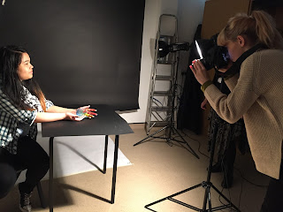
Monday, 14 December 2015

Transcribing Caro part A

The “Transcribing Caro Project” was my first experience exploring a 3D project also interpreting photography and a variety of elements joined together to complete the whole task. Firstly, I found a collection of primary research and images from my visit to the Yorkshire Sculpture Park and Hepworth gallery valuable because it allowed me to explore my manual settings on the camera further, and a range of media such as completing set tasks by my photography instructor and tasks set by my art tutor which was to complete one folding sketchbook of some of caro's sculptures. Throughout all of the visit to the galleries I took both close up and none close up's, also landscape photographs when exploring the wide range of sculptures. Collecting these images helped me a lot because I got an idea of what materials and shapes Anthony Caro goes for.  I also found it valuable collecting primary research from the gallery visits because it allowed me to compare Caro’s work in both galleries with the folding sketchbooks and images. It also helped me think of idea's how photographer's that use 3D elements could relate to Caro's work.  The trip was valuable because it allowed me to collect a variety of primary images that were placed into my sketchbook for further development and to explore ways in which I could put both Caro and photography together using 3D throughout the project. Also I found the visit important in particular as collecting primary images allowed me to look at 3D from a different perspective and different angles when taking images that was useful for the project and a photography point of view of 3D.  I found looking at the sculptures in real life better than secondary images because you can explore the piece at different angles and perspectives. Also it’s better to look at sculptures in real life because you can look closely into how the elements were placed together and this was shown in Caro’s work with strong fixtures and fittings. From my perspective it is  better to look at sculptures up close than secondary images because you can see how it fits in the environment and how other people in the gallery interact with the pieces. I think that my primary research turned out extremely well because I collected a variety of information, but mainly photographs as the photographs were to come in handy further into the project and also one completed folding sketchbooks from both galleries. I strongly believe my photographs showed turned out extremely well capture the landscape of the sculptures and looking at different angles and view points. Also I think they turned out well specifically for my primary research because I collected a variety of photographs not just photos of one specific sculpture. It allowed me to explored different types of caro's work, and the use of different materials, how the sculptures were placed and the scale of sculptures. I captured sculptures in ways that they looked abstract at different angles and perspectives and the photographs ended up looking great and it allowed me to use them for my sketchbooks also for my mini sculptures to just get a little inspiration to what my own sculpture would look like. Also including the one completed primary folding sketchbook turned out better then expected as it gave me observations or Caro's work from my own drawings with a variety of different drawing techniques.

The secondary research I collected was effective because I explored a variety of photographers that interact with 3D in different ways, these photographers were; Mark Bulford, Lisa Kokin, Lee Kirby and Joseph Parra. These photographers interpreted 3D in many ways such as projecting imagery, picture sculptures and so on. For my secondary research I collected a variety of images from each of the photographers and created sketchbook pages for each individual photographer and tried to copy some of there work and create it as how I imagined it would have been done or how to create it in a sketch book. Considering it myself as a photographer I thought it was quite challenging combining both 3D and photography as one. But, seeing some of the work of the other photographers I had chosen gave me a lot of inspiration.

Throughout the development stages for my 3D sculpture and 3D photographic sculpture task I have developed, organised and planned what I was going to design and create. Whilst thinking of a design that could also interpret photography was quite hard but whilst looking at photographers I had a inspiration from a photographer called isidro blasco who's work looked like this. I then thought on about applying some of caro's sculptures to my sculpture itself and making an elution that different parts of the sculptures were coming forward and some behind. 

Isidro Blasco  work

Monday, 7 December 2015

Ceramics workshop

On Thursday the 26th I had my last workshop ahead of me which was Ceramics, with my instructor Debra. Last time in ceramics I had a great experience doing it and my last project went extremely well because of it. To start off with we had to gather all research and sketches and dicuss our idea's with our instructor and see what ways, techniques and materials could be used to create part oof our sculpture.Once I had created them it will help me when I was exploring the other workshops for the sculpture. The task allowed me to solve problems in 3D and apply practical skills to create the final product. Also, the project allowed me to apply my knowledge that I have learnt in the previous ceramics task and use the methods within the workshop to create my final piece.
For this project in ceramics I did not really have much planned as it wasn't a main aspect of my design but I did have a small individual role for this workshop. My idea was to create something similar to one of Caro's paper sculptures but obviously with clay, clay that is able to go really thin that it actually looks like paper. The clay I used was paper clay which explains why I used it as I wanted it to look as realistic as I could get it. Firstly when messing around with any clay you have to need it and get rid of any air bubbles, because if  there is any air buddle's it is more likely to explore to the kiln. After rolling out the clay I measured 20cm x 20cm for both pieces of clay and once finished I ripped the clay off all around he edges of the clay as I did not want my paper to be just flat I put some round objects underneath the clay so that one it had been fired it would come out curved. Now all my ceramics work is finished I am now just waiting for in to be fire in the kiln.

3D workshop

On the 19th of November I continued to plan and create a photographic 3D sculpture for my project "transcribing caro". The 3D workshop was the main workshop session my sculpture was interpreted for as I needed to create practically all the elements that will connect all the pieces for my photographic 3D sculpture. I was inspired by an sculptor/photographer that goes by the name Isidro Blasco that involves 3D by overlapping images and making you see an image from either a different point of view or angle. By interpreting both Blasco and Caro I came up with the idea that I would use the same idea as Blasco by using my own images of Caro's sculptures from my visit to the Yorkshire sculpture park and overlapping them and creating a 3D photographic version of my interpretation if Caro was to be involved with photography and saw it from an abstract way. By creating a photographic sculpture it allowed me to see things from a different point of view and different ways 3D can be created through not only using ceramics, wood work and other hands on projects but photography also.

To start the session we were given a recap from the woodwork introduction about the health and safety that was required in the workshop. When we entered the workshop we were told to place our bags and coats out of the room away safely to avoid tripping hazards and causing serious injuries as well as if  left in the room it may get damage. We were also reminded of certain safety logo's on the machines which were "wear safety goggles", "wear eye protection" and "tie long hair up". The rules and safety signs must be followed at all times throughout the workshop to avoid any injuries. After recapping health and safety rules from the induction, we followed them all way through the workshop to avoid risk of injury.

Firstly, to start the workshop I collected all my secondary research of Blasco's work, images of Anthony Caro's sculptures and rough sketches. After gathering all my research and sketches I discussed to the workshop leader Brad my idea and what I wanted to create. When discussing to the workshop instructor Brad about my design I faced a problem which was think of how to create this idea I wanted to create and by looking at Blasco work try and get some sense of how he made it so secure and made it look so out there and 3D like. When coming to a decision I decided to start working on the base and how it was all going to stand so I made 5 stands that were stable and secure to, when making them I did not have exact measurements to what height was going to be but when me and the workshop leader were working at it we went along as it went and marked down the measurements to what I sticked to. After collecting measurements I measure upwards where the piece of wood for the base would go and once measured I took all the pieces of wood to the drill and drilled where it was marked. After applying the holes I drilled screws into the main piece's of wood going through to the other so that it was able to stand. I then got on to make a flat surface to place a background natured image onto.                

Tuesday, 1 December 2015

Print making and photography workshops

On the 12th of November I had my first workshops for the Caro project, being print making and photography we had half a day to finish both workshops. Before any of the workshops took place every individual instructor explain what the process was going to be and for print making it was that we were going to be making an etching print either to make prints go on to out final sculpture or to make the etching part of the 3D sculpture. The process on this day was that print making would take place in the morning and photography in the afternoon. Moving on, when starting early hours on print making I was oblivious on an idea to do but not only that thinking of something that would relate to Caro's work and being the photographer I am I decided to be adventurous and use one of my photographic images I had taken of one of Caro's sculpture from my visit to the Yorkshire sculpture park. After choosing one individual image I was instructed by Jess, our print making instructor, to start collecting and sketching ideas, from the image I had chosen I started to collect basics shapes on the sculpture and drawing them as they were but more simple and adding detail and with a sheet full of different etching techniques, I was able to see what each tool looked like on a etching plate without testing it myself and making any mistakes. Firstly, I got my etching plate and removed the plastic base and began etching the basic shapes of the "Caro" sculpture I decided to use. I then tested it with black ink and a white play piece of card to discover that the print wasn't showing up as good as I wanted it too. So, I used a wood carving tool as my instructor "jess" recommended it as she has a lot of experience. By using the tool I was able to make deeper and thicker lining and which the etching tool I used before I was able to use it for great detail. It then enable me to then make more finer and better prints.

Once we had finished our etching plates and final prints we then moved on to the photography workshop At the start of workshop I was curious to explore photography because  was unsure how it was going to relate to the “Transcribing Caro” project. When arriving at the workshop we were given a task which was to create an interesting, abstract paper sculpture that was going be taken into the studio to be used to create different shadows and lighting techniques. The piece we created had to be 3D like Anthony Caros work and incorporate an abstract layout in the design. Before we started to create our designs we were given instructions about health and safety which we followed throughout the task. As we were using craft knives, we had to be careful when using them as they can be very dangerous. We also had to use a cutting mat on the surface to avoid damaging surfaces. Also we had to use a metal ruler to avoid cutting yourself when cutting straight lines as craft knives can easily move out of place. These instructions were followed throughout the workshop. For my designs I did an archway in simple terms kind of like a rainbow, one with swirls twisted stuck to the top of the card and last one I cut out shapes like fire and stood them up. I decided on all of these designs as I knew what would make a shadow and what wouldn't as I have experience when it comes to the studio and lighting.

Monday, 23 November 2015

3D Workshop Introduction

On Thursday 5th November, I was introduced to elements of the 3D workshop. It was important to complete this workshop as it taught me the safety and knowledge of each machine that I can use throughout the course. Also it was important to complete the workshop as I wouldn't be able to complete the brief for the "transcribing Caro" project, another reason being that if we didn’t do the workshop we wouldn’t have been able to go on any of the machines as we hadn’t properly been taught how to use them or shown the proper safety risks. For me I found the workshop quite easy and simple as in my past school I had already been taught and shown how to use the equipment in a lesson called “product design” that I had studied for gcse. However, the experience was useful as it did remind me of my previous knowledge that I had forgotten in 3D. I was curious to explore the workshop as it allowed me to think about the materials I could use in the "transcribing Caro" project.  Throughout the workshop we followed the PPE (personal protection equipment) for the health and safety instructions.  Firstly, all loose clothing had to be removed for instance baggy jumpers, cardigans, scarfs  ect, long hair had to be tied back to avoid the risk of being injured and getting trapped in machines by these elements. Bags were not allowed to be placed in the workshop room because they are a tripping hazard which is dangerous for a room surrounded by machines. Also, lanyards must be removed for our own safety as they can get caught in machines which make it very dangerous when working. Finally, strong shoes must be worn in the workshop to avoid the risk of injury to your feet if any equipment fell on the floor. All of these instructions were followed throughout the 3D workshop introduction.

Monday, 2 November 2015

Yorkshire Sculpture park and Hepworth Gallery

On Wednesday the 21st October myself and the rest of my course visited the Yorkshire Sculpture park and the Hepworth gallery to explore the exhibitions and works of Anthony caro, a sculpture which helped us get ideas and inspiration for our upcoming project. By exploring both galleries it allowed us to visually collect information and inspiration to start our new project which is based on 3D and the sculpture himself, Caro's work.

At the start on the day we went to the Yorkshire sculpture park to explore Anthony Caro exhibition at the longside gallery. Once we arrived at the gallery, i was separated from the rest of the group to be given an individual task relating to my photography which was to focus on one of caro's sculptures and capture different images focusing on both the landscape and close up's of sculpture itself. The task itself was set by one of my new instructors who goes by the name even who gave me great feedback and really liked my work. Not only did i do the task i focused on all the landscape capturing different sculptures and the autumn season looking its finest. After my individual given, my course instructor Claire Harrison set everyone a task which involved sketch books we made at the start of the day, in them we were told to do quick sketches to create a range of drawings that observed different pieces of work in the gallery. All the drawings explored different uses of materials but as i noticed caro used a lot of metals in his work which to me made me think that he was a very handy man and likes DIY. It also allowed us to explore different displays of work viewed at different inside and outside of the gallery at different angles and perspectives which made the pieces of work more interesting and detailed. The display of the work also change my view point of the work itself as i believed it helped to figure out the meaning behind the pieces of art  and how it related to the kind of materials being used. Some of the pieces of work made me think of industry as a lot of metal was used and were displayed on plinths which helped me to view the pieces better as they related to construction sites and factories. However, some pieces of work were displayed on the floor which made me view them from an organic point of view as the materials used were natural. Throughout the trip i constantly took lots of photographs capturing the pieces of work from different angles and points for instance low points, high points, close ups and landscape focus. With these photographs i will be able to use them for my sketchbook and work more into them from my perspective. I felt i was able to capture more from the sculpture park as i had natural light and the quality on the sculptures from outside were amazing.Also the Gallery focused on more of Caro's smaller pieces of work and were great for close up's.

Overall, I found Caro's work in both galleries both unique and interesting as all the pieces of art expressed individual inequality, also similarities with the types of materials that were used. I found some of the pieces work mysterious in a way as they had hidden details you couldn't just look at it from one angle there were loads of angles needed to been seen with different details and interests of the piece of art. The trip gave me some inspiration for my upcoming project with evidence being shown throughout my sketch book.

Monday, 19 October 2015

End of project Evaluation-"hands on"

Throughout the “photography hands on project” I have used photographic experimental application to explore characteristics of a wide range of visual language by showing hands in different ways for each individual characteristic. To use visual language we explored the “principles” and “elements” of design and key terminology from the workshop. The key words in the principles include pattern, contrast, emphasis, balance, proportion/scale, harmony and rhythm/movement. The key words in the elements include colour, line, shape, texture, form, space and value. We used visual language by describing all three elements above through our glossary pages and presenting them through images of hands that relate to the definitions of each key word. By creating my own definitions as a visual image made me understand the key term better than the actual definition. I used visual language also by producing 19 glossary pages that have images taken by myself in the photography studio and edited myself on Photoshop at first I found it quite difficult to use this type of media because it was my first time using it but as I made progress and the five weeks went along I was capable to teach myself as well as Victoria my instructor teaching me skills that would be more effective for the project. I have also been able to visually use visual language in the workshop tasks to complete each workshop outcome to relate to key terminology.    

I feel learning about terminology and producing a glossary has improved my English skills in different ways, as producing a glossary I have learnt different meanings for each individual words for both principles and elements. Also throughout each day of going through the project I have wrote on my blog: lala-2010.blogspot.com about the workshops I took part in and the keys words that we were given to also produce a glossary sheet out of. From writing about my workshops has allowed me to use me literacy skills because without having to summarise my workshops and glossary pages I would forget key skills in English that are needed every day. For research I produced both primary and secondary, primary being my own images where I took them in the photography studio where I work every Wednesday with my instructor Victoria. Where we look at different lighting and look at different angles, also including different backgrounds seeing what lightings work best. Ever Wednesday we focus on a different lighting technique used for portraiture and I myself get to be the photographer as well as modelling. Secondary research is photos from a different research source for instance I created a Pinterest board called ‘hands’ and got all my secondary images from there but when it came to drawing secondary images I simply search hands on google and found drawings more my style. My research was very effective during this project as it gave me inspiration for my glossary sheets and sketch book work also.   

In each individual workshop I have learnt many new skills and techniques, some I have never heard of and some I had never tried. Firstly, photography my main forte and what I am studying. In the workshop photography I learnt about the main aspects of manual settings being: Shutter speed(self-explanatory): Which is in simple terms the shutter at the front of the camera what focuses on the object or area you are taking a picture of, for instance on the camera the shutter is open when your finger puts pressure on the button. Aperture (opening): The aperture is basically an opening, hole, or gap. So for example the larger of the opening the more light is passed through but the depth of field will be smaller, where as if the opening is small there is less chance that the light will pass through. ISO (quality of light): The camera's ISO setting is its sensitivity to light. The higher the ISO, the more sensitive it is. Exposure:  A photograph's exposure determines how light or dark an image will appear when it's been captured by your camera. As well as learning all the manual settings we were taught lighting techniques such as high key lighting and low key. Every week I have a one to one photography session with my instructor Victoria as because there are only two students doing photography including myself we don’t get that much time to focus on our actual course. We focus on our portraiture and the lighting that can be used when taking a portrait photograph of someone and the lighting that we have learnt so far that can be used for it is: Rembrandt lighting and butterfly lighting. The “Rembrandt lighting” is a type of lighting that is popular because it is capable of producing images which appear both natural and compelling with a minimum of equipment. You will be aware when Rembrandt lighting is at work as you will see a triangle shape underneath the subject’s eye, also for the triangle to appear the light should be placed above the subjects head almost at the side of the subject also. This lighting is mainly used with a dark background and depending on the lighting it may turn out either lighter or very dark. Whereas when using “butterfly lighting” there is always a light background Butterfly lighting is one of the oldest techniques and types of lighting used in photography for lighting a subject. It is named butterfly lighting because when taking a photograph a butterfly-shape shadow should form underneath the subject's nose; this setup is a proven method to ensure your subject is well-lit in a pleasing manner.

The next workshop, ceramics, I learnt many different skills that I quite enjoyed doing. I learnt techniques such as how to avoid air bubbles in clay so that when you have made your model it will not explode in the kiln, how to mould for instance me final idea was to make a mould of my hand so that it had all the texture and detail an actual hand its self would have. During the process of moulding you have to cautious that it wont burn or damage your skin so you have to put either hand cream or Vaseline so that in protects your skin. After ceramics i was introduced to 3D which i didn't in particular enjoy it as other workshops as it was not my forte but considering it wasn't, i did learn new key words such as abstract. i had already done a little of 3D in GCSE for product design where we have to mess around with flat pack and when it came to creating our designs we have to slot card together to create our models and also the final piece. As I found it quite hard my final piece wasn't as creative at i wanted it to be. Next workshop was print making, which i quite enjoyed with my instructor jess. I learnt techniques that i'd never done before which was lino cutting where you create a design either just a design or on the shape of a hand on a lino using a lino blade. These workshops were incredibly effective for my photography work as with my ceramics model i was able to create shadows and also great quality as when it came to editing it on Photoshop, i used to sharpen tool which gave it emphasis. Moving on to 3D using my final model in the studio allowed me to create harmony and form by using white on white aswell as creating a motion that the model was a waving hand. Bare in mind with print making as it was only lino i was limited to things i could do photography-wise but i was able to create a emphasised image by allowing the lines to be brighten and the background to be darkened. My last workshop was textiles, which as it was on the deadline not many key terms were explained through the process but we did get taught methods throughout the workshop which were: screen printing, batik, puff binding and heat press. 

In the process of my workshops most of my out comes came out unexpectedly better than i imagined, but on workshops such as print making it was quite hard to make it look perfect considering the tools were not that accurate to use. Once ink was applied to the lino and printed onto cartridge paper the pattern was more effective rather than the actual cut out itself, but some of the pattern was not cut out to how i wanted it to be as it was my first time it was bound to happen no one is perfect the first time. Where as in my ceramics workshop, which was by far one of my favourite workshops that was set as i got to experiment with plaster for my final piece which was quite extraordinary. By moulding my hand it gave me final piece emphasis and effection as all the detail from my hand was moulded into the mould just how i wanted it. But i did discover difficulties during my time in ceramics as when i had to leave the clay to dry out i took it out of storage to take a photo and because it was so fragile without me knowing i laid it onto the table and the fingers collapsed but i was able to apply slit onto the fingers to re-join them and now it is secure ready to be fired into the kiln. One workshop outcome i wasn't expecting to go down well was 3D as i didn't enjoy it due to it not being my cup of tea, but the outcome was unexpectedly creative. It was made to look like a motion of a waving hand which it did but also looked like a chandelier. The textile outcomes were very effective but very easy to do as all three were simple. Batik was a wax method which was similar to drawing in a way but it standing out as the wax dried. Screen printing where depending on the ink colour and what fabric, the method was easy, also buff binding was the same method as screen printing except you use a heat gun at the end.

Overall i think all of my portfolio of photographic images and work along side it, is effective as i have used all my skills on Photoshop to create, creativity and imagination. I also think it has presented my skills, knowledge and the understand of the project itself, through all the work that has been produced on the outcomes of workshops as well as glossary sheets. i believe my glossary sheets are effective in my portfolio of work because it presents a true understand of the key terminology by using a camera to produce such meanings, also how it expresses my imagination and creativity. Throughout the project i have come to terms with is that i need to manage my time efficiently and effectively as towards the end i was rushing to get everything done. It has learnt me also that when you do a piece of work try and get it finished because every little thing counts towards it all by the end What i have noticed is that i had a few bits and pieces that weren't finished to great quality so this is a number one tip i will bare it mind. 

Throughout the project we explored the elements of creativity and how creativity is presented through both art work and photographic images. We also learnt about how creativity is measured, where about the it is presented in a specific environment. To identify and get a image in our heads of what "creativity" was we were set a task to work in a group and by putting all our ideas together get an image of what creativity is. Throughout the project we have explored creativity in many ways by taking part in workshops and creating a piece of work that defines a word and our glossary sheets which by creating these we showed creativity by making our glossary sheets into meanings so that they spoke for themselves. I feel like i have improved my creativity remarkably well as i have learnt new techniques and skills which allowed me to use my individual ideas and show more of my creative side. 


Saturday, 17 October 2015

Textiles workshop

Last week on the 15th of October I had my last workshop, which was textiles but considering it was on the actual deadline day of the project we didn’t experience the full day of textiles. Textiles Technology helps students develop their creativity. This two-unit specification requires students to develop their ability to make textile products, a vital feature of candidates' experience of taking this specification. The workshop was led by our instructor Kat, a textile expert who has taught it for around 15 years. Unlike other workshops we straight away got into different activities with Kat instructing us as we went along due to time. As we were going along we were introduced to different methods of textiles, these being:

Screen Printing: A force of ink or metal on to (a surface) through a prepared screen of fine material so as to create a picture or pattern. Also a technique where mesh is used to transfer ink onto a substrate, except in areas made impermeable to the ink. In the workshop, we used materials such as cotton and calico to produce prints.

Batik: A method (originally used in Java) of producing coloured designs on textiles by dyeing them, having first applied wax to the parts to be left undyed. In this method, wax is melted to create the pattern using a tool called a Tjanting . This tool is used to apply melted wax onto either paper or a material then once the wax is applied it will the dry and the once you apply colour the wax will stand out enabling the pattern to been seen.

Puff binder: Puff binding is used in the same way as screen printing but after heat is applied with a heat gun and allows it to rise to create a 3D effect. Also for a better effect dye can be applied to create a little tad of colour.

Heat press: A heat press is a machine engineered to imprint a design or graphic on a substrate, such as a t-shirt, with the application of heat and pressure for a pre-set period of time.

Sunday, 11 October 2015

3D workshop


On the 1st of October I had my third workshop which was 3D, instructed by our 3D instructor Adam. During the first part of the workshop we were introduced to some of the key words from 3D and health and safety issues. These words were: shape scape, cutting matt, abstract, slotted cardboard, and scalpel, craft knife and slot puncher. Most of these key words are mostly equipment apart from shape scape which is a sculpture in a box aimed at adults to construct an infinite number of sculptures from the same set pieces. Also abstract which is art that does not attempt to represent just one individual image but instead uses shapes, colour, forms and gestural marks to achieve its effect. Firstly, Adam showed us a designer called Peter Mayor who designs shape scapes. As the workshop included working with a lot of sharp objects the health and safety was priority, so for instance when using the craft knife do not press on to hard and to only cut towards your body so that you have better control of cutting and the knife. After seeing a few of Peter Mayor’s designs and going through the health and safety prestige’s we had ago at making our own shape scapes. I ended up creating a plane which also turned out looking like a rat from different types of angles. After the first part of the work shop we started to bring our “hands on” project into process of 3D before thinking of idea’s Adam our instructor showed us some of his models relating to the hands of project, but I found it quite difficult as 3D isn’t one of my strongest points and I was very limited with idea’s as 3D was one of the last workshops of mine. What I did was draw around my hand on to the card and carefully cut it out with the Stanley knife which I found extremely easier to use than the scalpel. I then started to bend and play about with the hand and sketch out an idea, which ended up looking like a chandelier of hands but also looked like a waving hand to make it look more abstract. It wasn’t always easy throughout the workshop I sometimes wanted to give up but once I continued to think about it and played about with the card I finally got an idea and managed to create what I wanted.        


Monday, 5 October 2015

Photography-butterfly lighting

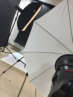
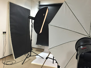
On Wednesday 30th of September I had my second lesson of photography with my instructor and photographer herself, Victoria, where we concentrated on a different type of lighting this week, called butterfly lighting. Butterfly lighting is one of the oldest techniques and types of lighting used in photography for lighting a subject. It is named butterfly lighting because when taking a photograph  a butterfly-shape shadow should form underneath the subject's nose, this setup is a proven method to ensure your subject is well-lit in a pleasing manner. Butterfly lighting is considered the ‘fashion’ or ‘glamor’ lighting setup, it is mainly used for portraiture. When using "butterfly lighting" there is a specific diagram on setting the lighting up in a studio, but has only little equipment. For instance the equipment required is one key light and a white background can be black but for butterfly lighting white is more effective. The key light is placed above the camera pointing towards the subject. Sometimes when using butterfly lighting you may want to add a reflector on some odd occasions if you cant get that butterfly shape underneath the nose. As always myself and my other colleague both took the opportunity to take photos of one another to get the perfect photograph showing that we were able to use butterfly lighting. Only I choose to remove the camera from the tripod and explore different angles instead of capturing the same image repeatedly.


Sunday, 4 October 2015

Art Glossary-extended

On the 29th of September I continued to work on my glossary sheets for my “hands on” project that we are concentrating on until the 15th of October. Recently because I am concentrating on photography and I am studying it I have been told by my tutor, Claire Harrison, that I am now allowed to explore my skills on Photoshop and start to create glossary pages by taking my own photographs and editing them related to the key principles and elements of design. On Photoshop I explored different ways in which I could edit every photograph I had taken using hands in different ways, for instance increasing and decreasing the lighting and also contrast and sharpening edges to increase the quality. This time I choose the words “colour” and “movement” and used photo’s that I had taken in a photography workshop. The meaning of colour is the property of an object of producing different sensations on the eye as a result of the way it reflects or emits light. Whereas movement simply means the act of motion and energy. With the word colour I simply used an image where the hand itself had dried up paint on it and when editing it I brought all the focus to the colour on the hand and increased the brightness, not only to brighten the photograph but to increase the quality of the photograph. Whereas on the “movement” photograph I already had the technique I needed to create movement but when it came to editing it I knew I needed to increase raise the brightness to create more movement. By using adobe Photoshop I found it incredibly easier to do instead of drawing because It’s something I want to do and puts me in the right mind set whereas when it comes to drawing I am not in the right mind set as I want myself to be in. I intend to move on to the word space next in the process of our project. After progressing on our glossary sheets, our tutor Claire Harrison gave us a task where we were given either a element or principle of design to each table working as a group to come up with an idea related to that work. We were given the word contrast and the 3rd picture down was our idea.

Monday, 28 September 2015

Ceramics Workshop

Last week on the 17th of September I had my second workshop, which was ceramics. Ceramics is pots and other articles made from clay hardened by heat. This workshop was led by our instructor Debra who has a lot of experience with this type of art. The workshop started off with Debra going through some ground rules on all the equipment and other health and safety policies so that we would be safe and act sensible during our time in the ceramics room. After the rules were lay out on the table, Debra then learnt me and the rest of the class on how to role clay and get rid of any unwanted air bubbles in the clay itself. To make sure we didn't have any air bubbles we used a method called wiring where you slice the clay sideward's on to double check the clay. You want to avoid having any air bubbles in the clay as if it does when placing it in the kiln, and when heat is being placed to the clay heat will be trapped in the bubbles enabling it to destroy the clay work or in other matters blow up. If you are wondering a kiln is a furnace or oven for burning, baking, or drying, especially one for calcining lime or firing pottery. Once our clay was rolled out with no air bubbles Debs wanted us to place out hands on the clay and using modelling tool to mark around the edges for a group activity she had planned for us later that day, but sadly had no time at the end to get to it. After the hand carving, using the project brief we had been given for out art class we had to use our creative imagination to think of something to do with hands. I myself then decided to mould my own hand using plaster, taking about five to ten minutes to set just one side of my hand. I also did it to the other side of my hand. The detail that was in both moulds was remarkable they had all the texture in the moulds for instance the lines on the palm of your hands and nails also knuckles. Once both moulds had set and hardened up I started to place fresh pieces of clay into both the moulds and after placing the clay in all of the moulds I took away the extra pieces of clay that were not needed. I then took both clay moulds out of the plaster moulds and placed them together with slit. I wanted to make the hand look as realistic as I could get it. After seeing the results I decided to making another hand and cleaned both them up with cleaning and carving tools to get rid of any excess clay and to add further detail.  


Thursday, 24 September 2015

First Official Photography Lesson

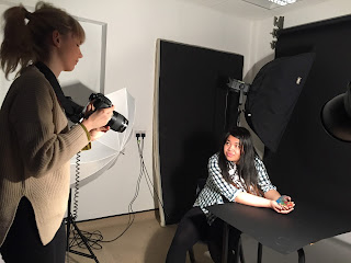
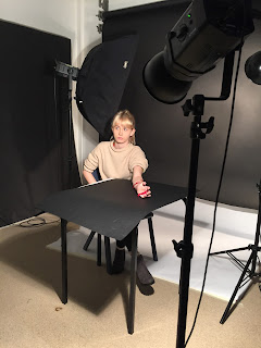
On Wednesday 23rd of September was my first official photography lesson with my instructor Victoria, where we explored and set out eyes on our first type of lighting called Rembrandt lighting.  When using Rembrandt lighting there is a specific diagram where everything is place in the studio, for instance the equipment that is used is a light sauce, a subject, camera and a reflector. This equipment is all placed is certain places to create the perfect Rembrandt lighting. If you aren't awhere what "Rembrandt lighting" is, it is a lighting technique that is used in studio portrait photography. This type of lighting is popular because it is capable of producing images which appear both natural and compelling with a minimum of equipment. You will be aware when Rembrandt lighting is at work as you will see a triangle shape underneath the subjects eye, also for the triangle to appear the light should be placed above the subjects head almost at the side of the subject also.
As you can see in this diagram every piece of equipment is placed in a specific place but if the triangle does not appear it is either because you need to instruct your subject to either turn their body or face, or perhaps move your key lighting until you reach the point where you have the perfect triangle underneath the eye. Myself and my other colleague both took the opportunity to take it in turns to experiment this type of lighting on one another and found out using a black background with no lighting except the key light also including the subject sat on a stool looking straight at the camera worked extremely well. Through the lesson we had two shots, one where we used a dish reflector with the image number being 100/8142 and the second shot with the dish reflector also plus adding a silver reflect with the image number being 100/8155. During both shots we were introduce to a white soft box which soften the lighting and really gave an image its best quality, where as white out it made the lighting on the image really sharp and gave it a dark look. When changing the silver reflectors position the image number changed each time, for instance when to the side the number was 8163, above was 8164 and underneath was 8162. Next photography lesson will be all about butterfly lighting which is also used for portraits.

Wednesday, 23 September 2015

Art Glossary

In art and design we have been assigned our first project "hands", this then has led us to being introduced to a wide variety of key words that by using images of hands express the words meaning by drawing hands but also showing how the words can be shown in the drawing technique or any other type of media. This then led us to creating glossary pages for everyone of these words and using our imagination to create the perfect imagine definition alone with the actual definition. We have started creating the glossary pages by a method called stretching paper, which enables us to work on a hard surface(wooden board)as well as working on paper also we were directed by our tutor Claire Harrison to draw two A4 boxes on to the paper so that when they were finished we could we could cut them out. We were introduced to the principles of design, which are; contrast, pattern, emphasis, balance, proportion/scale, harmony and rhythm/movement. Where as last week we were focused on the elements of design, that are; line, shape, direction, size, texture, colour and value. I then started my glossary pages for the elements of design and started with the key words "value" and "lines". For my "value" piece I drew a black and white hand so that the colours would contrast, also by using pencil I was able to add detail and shadows as value itself means 'lightness or darkness', also for the title itself I used our newspapers to represent the lightness and darkness. I also did the key word "line" and I used my pinterest account to research other images of hands drawing with lines or based on lines as I was very limited to what I was do because everyone in the class pretty much did the same for the key word lines and I wanted to be different and attempt to stand out, so I drew the outline of a hand a drew lines with pencil inside to show depth and detail of the hand. I then moved on to the principles of design which is the most recent of what I have done up to date. I chose contrast but unfortunately only managed to do one piece of the key words but it took so much time and effort as I put so much determination into it and tried to bring some of my own photography work into it, and so the photo that I used of hands I banished the background and made a background of my own with brushing inks that were grey and blue. With brush inks you never know what it is going to end up looking like so that is what made doing my own background exciting. As drawing hands didn't quite excite me it was such a positive to bring in photography into my glossary pieces.

Tuesday, 22 September 2015

Art Critics

The role of an Art Critic is someone who specializes in analysing, interpreting and evaluating art from there perspective, either in a negative way or positive, and there view on art itself or a piece of art. The public in the 21st century tend to associate negativity with the word "critic" but is also seen as a positive as critics nowadays help their readers become aware with the artwork of today and enable to readers to make their own judgements on either their own piece of art or others. Art critics respond to different pieces of artwork by explaining the art, finding either the hidden meaning behind it and also making critical judgements hence the name "art critic". There are three main types of art critics that define art all so differently. Firstly, there are journalists who generally write for the general public of today but also includes their own perspective on art galleries and exhibitions. Another type of critic, there are newspaper reporters that are assigned to write about in particular pieces of art and exhibitions to the general public, which sends a clear view of the art piece. Finally, one last critic is a scholar who are actual artists themselves that write from a professional point of view or texts about other artists. In today's society, critics tend to focus on modern and contemporary art that matches the individuals culture. Art critics have a very important role in the world of art as they respond to varies of different art work that inspire and help audiences make there own judgement in the present day and future.

One example of an Art critic is a man named Robert Hughes, who was not only an art critic but a writer, and a producer of television documentaries. The man was described in 1997 by Robert Boynton of The New York Times as "the most famous art critic in the world".

Friday, 18 September 2015

Photography Workshop


In art and design/photography, we are given varies of different workshops to complete in the next upcoming weeks related to our new project “hands on” to create imaginative and unusual pieces of art. Each workshop is different, for instance there is photography, 3D work, paint printing and many more all to be seen in my blog in the upcoming weeks. My first workshop was photography and I and my two other class mates were guided effortlessly by our instructor Victoria who is also a photography herself considering her worked has been in magazines, newspaper and even vogue which likewise I would like to achieve.

In the process of the workshop we were learnt different types of techniques such as using manual on a camera and what comes along with it like:

Shutter speed(self-explanatory): Which is in simple terms the shutter at the front of the camera what focuses on the object or area you are taking a picture of, for instance on the camera the shutter is open when your finger puts pressure on the button. The longer the shutter is opened for the more blurred the image with be where as if it is only open for a short amount of time it won’t be as blurred. Also on the camera you will see something like this “1/60” this is the shutter speed and the higher the number the clearer the outcome of the picture will be.

Aperture (opening): The aperture is basically an opening, hole, or gap. So for example the larger of the opening the more light is passed through but the depth of field will be smaller, where as if the opening is small there is less chance that the light will pass through. Likewise on the camera the aperture will look like “F24”, for example if the number is small the hole on the camera will be wide open but the area of focus will be small which leads to a shallow depth of field. Nonetheless if the number is fairly large the hole will be smaller and it will enable your camera more focus and a larger depth of field.

ISO (quality of light): The camera's ISO setting is its sensitivity to light. The higher the ISO, the more sensitive it is. As well as letting more light pass through it also collects information. The less light passing through the higher the number looking like this “iso” on your camera.

Exposure:  A photograph's exposure determines how light or dark an image will appear when it's been captured by your camera. This is why elements are required such as if you are in a studio you will need different types of lights. We used flashguns, flash head reflector, Light Modifiers, Light Stands & Mounting and much more.

Throughout the workshop we were given little projects to do each individually or in groups. Firstly, we were all given a camera and were instructed to change it to black and white, to explore different effects and change the techniques we were shown to get a good quality, but remarkable photography of our hands. We had to explore and experiment with the camera’s and use our thoughts to create something unusual that no one had ever done and think outside the box. Throughout our first project Victoria was explaining and describing the main words also another technique called the rule of thirds what all photographs need to have the best quality. A good photography must know these certain words, such as; balance, leading lines, pattern, alternative view point, framing and experimentation. All very important and lead to the perfect photograph. But not all of these are required in every photo in depends on what you are wanting to capture and how effective you want it to be and so much more.

Balance: Is a compositional technique in photography that contrasts images within a frame so that the objects are of equal visual weight.
Leading lines: They're used to draw a viewer’s attention to a specific part of the frame, whether it's a person or an object.
Pattern: A good look to make the photograph look more stimulating and unique.
Alternative view point: Is different and unusual angles that photographs are taken from, for example from an above view or lower view.

Experimentation: Using your own and unique ideas and purposely discovering something unknown, also be creative.

Moving on to project 2 we started to explore and create different types of images using different types of light equipment and thinking of our own independent ideas to try and show either our true colours, personality, a life experience. It could have been anything but it had to capture something related to you with your hands using the studio. I choose a very deep thought for my project relation to my pasted with bullied and I felt confident with my idea which showed anger and relief in the photographs that had been taken of my hands showing my idea and emotional side. In the process of all of our project we went through small difficulties with the lighting but it wasn’t a problem as we were constantly adjusting, taking a photo, adjusting, taking a photo until we got what we wanted in the process and knowing we would get there in the end. Another difficulty for myself was using adobe Photoshop as I had only ever used it once before in my whole life time but it did not stop me from getting one of my photographs perfect and with Victoria’s help made it happen. Overall, I found the workshop very inspirational as I too aspire to be a photography and to be taught by Victoria whose work has been in magazines and many more public places, it just topped it off all off and put me in the right mind set on what I want to do myself and I know I will work incredibly hard to get there. Just working in the studio made it all seem all real and hopefully one day it will be. One thing I think we should have changed was doing more projects the workshop was just not long enough so for next time because I  have a huge affection for photography I think it should have been extended, also to show more skills being used by myself my class mates.
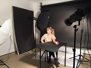


Domino Effect


Yesterday morning I explored ways in which neither I nor my other class mates would have bounded together. Creating imaginative things such as sculptures and playful art, bringing out everyone’s true colours. We were all guided smoothly by an artist called James who gave us guidance and inspiration all throughout the day. I would say that it is extremely important role to play an artist as it releases the inner childhood in yourself and can encourage you to make your work more fun and engaging to the fellow audience. Whilst all the current young artist were creating developed sculptures I myself as a young photographer took the chance to catch natural images throughout the day of friendship being created, team work and the skills being brought to the sculptures. I explored different and unusual angles around the room catching the quality of either objects or people in action.

The elements we took forward in the process were developing our thoughts and ideas from the start to create a range of ideas and putting it into our work for our none existing sculptures what were about to be created. Which by the end brought out the best in everyone’s imaginative ideas. After working independently catching the natural images I needed I later on joined in with the creative activity James had set for everyone on a much larger scale. We worked as a team by agreeing with everyone’s individual ideas for instance the kind of shape the sculpture was going to be and how it was going to stay firm without braking. I personally think creativity is extremely import not just to me but to everyone around the world it really does bring out the good in people and how talented some people are. Creativity brings out the inner child in everyone because without having any interaction with art, I highly doubt anyone would have any imagination, they would just be left blank.

As a group we combined our creativity to create a sculpture which reflected our ideas and thoughts. We divided up our responsibilities by working in pairs within the group to concentrate on different areas of the sculpture. This worked efficiently as in brought the individuals closer together within the activity, and increased our communication skills. Throughout the activities I distance myself from the group to allow myself to explore further into photography making sure I mastered the basics for instances close ups (superzooms) and the lighting of the room. Normally I would use reflectors but as it was my first time on the course I was just proving to the others and myself I know what I am doing when it comes to photography as it has been my passion to be a photographer ever since I was young. I aspire to be in the industry of fashion someday. With the photos I have taken I have adjusted the lighting and contrast to improve the quality of the photos.

Some problems the groups encountered were when they attempted to make smaller sculptures they came to the conclusion that because they weren’t as sturdy and collapsed several times, they stuck to a much bigger surface area. To solve the problem, I myself explored different designs just be walking around the room looking for inspiration and even looking out of the window at the buildings. By sharing my ideas with the group it then led us as a team to change the layout which made it stable and more efficient for the design. This helped me to adapt my skills into the group task whilst also sticking to my photography side of it. The team also faced many different problems just by the sculpture falling down and straight away the team over faced this by fixing the piece and by learning from the mistake change the design.

I recorded the “Domino Effect” by concentrating on my Photography and taking photographs at a high standard all throughout the day to show my skills with a professional camera as I have a lot of experience with them I was able to prove my skills. By taking photographs all throughout the day it showed the progress that was being made with the individuals and also the sculptures. At the end of the workshop we created a mind map to reflect on the day and what everyone had learnt from it. The workshop helped everyone’s social and team working skills all throughout the day and the skills that not only me but the other individuals learnt will overall help us with our lives and my photography course I will have these skills to help me for the next two years maybe even for a life time.  Throughout the day different tasks were set at different times which we followed from the instructor James. As a group it allowed us to plan what we were creating, also explore new techniques and patterns with the dominos. We followed the time we were given accurately and we also had time to spare which allowed us to pack dominos away ready for the next task.

My individual strength’s and tasks were to capture the natural moments whilst individuals were at work and getting to know one another using not only one brain but the groups together. I adapted and developed my surroundings by correcting the lighting and the contrast either making it lighter or darker to increase the quality of the photograph showed my creativity and effort towards my task. I personally think I did my work to a high standard and allowed me to be as creative I can be with the camera by taking photos at different types of angles for instance; side view, above view and many more.

At the end of the workshop the whole entire class created a final piece, which I feel explored every individual’s ideas in the process. As everyone’s skills developed further and further throughout the day the final piece of art was just faultless compared to everyone’s recent designs. I think one thing we as a class could have improved was arrangement work with the dominos so it would be more engaging and creative.

My overall thought of the day was that it was such an inspirational experience because it taught me that there are so many ways out in the world to get individuals working together as a team and socialising, also not being scared to share their opinions and ideas they have because everyone’s opinions and ideas matter so much. If no one ever opened up and shared, everyone would be extremely dull and creativity would be lost. The day also taught me that without creativity and excitement fun art wouldn’t exist, and how important it is for an artist to explore and just be enjoyable. The workshop was also a great success as I got to show my abilities and interest at heart by using the camera and proving I am worthy of photography. It has also helped me gain confidence in showing what I can do within my photography course, and socialising with people I have only just met. Overall, I would recommend this workshop to any other class as it really does benefit you in any way for your course in college. The workshop has helped me a lot within my photography course and to communicate with others.