Thursday, 25 May 2017

Magazine Influences

Sketchbook Pages
For my final idea my plan is to create a magazine cover so I took the liberty of using the research source Pinterest to find types of magazine covers from todays generation I believe I can take forward within my work. This led me to finding these specific magazines displayed in my A4 sketchbook. I chose these magazines as I felt that they fitted in with my chosen theme "Grunge" as I feel that that the magazines pushed the boundaries of how a magazine a stereotypical magazine should look. I love how as well as their titles being the main focus on the magazine they have used specific poses to also represent their magazines. I also admire the choice within colour schemes as they have either use contrasting colours to make the magazine more dominant or they use colours within their so that the cover as a whole is a balanced and well thought out design. However, I feel that all of these magazine covers main focuses are on the title rather than the model so when I come to design in Photoshop I plan to experiment and see what my designs look like with when using the rubber tool to create erase part of the text covering the face.

I feel that this research of magazine covers is well thought-out as the layout and outlook on all of these magazines are cutting edge and link very well with my "nineties grunge" choice.  I plan to take elements of these magazines forward with me such as the bold text and the layout as well as the unusual choice of poses. I feel that creating a series of magazine covers would be a better idea as I'd rather than create four covers that are completely different designs.

Sketchbook pages

Prints gone wrong and mounting work

These images are a record of one of the main issues I encountered that went wrong towards the end of my project. When coming to print my final outcomes down at the reprographics department, I applied my work on a memory stick and saved as a PDF to enable the process of printing because if not the department would be unable to print my images. However, when going to collect my A2 images they had printed out in a very aluminous orange which I had already experienced this in particular problem back when I was printing my photographs for my portfolio. The problem really did infuriated me as I hadn't time to waste as I needed everything done for my deadline. The issue thankfully wasn't anything to do with my images but with the settings on the printer in the reprographic department.

To overcome this problem and due to my patience being very little when going to the reprographics department I decided to go over to the UCB building and ask one of the university tutors, Evan, if I was okay to print my final outcomes on the large format canon printer as I had  used it before with no problems regards to quality and the tutors over at UCB are extremely helpful when encountering any problems. 

When at UCB I successfully got my final designs printed and after printed, I was shown how to mount my printed outcomes on to foam board using a bray booth and how to properly cut out using a Stanley knife and ruler. 


This is a video of the UCB tutor showing me how to properly
mount my images ready for my exhibition in June.


These are the tools I used when mounting my final pieces, the spray when used had to be in a spray booth due to unpleasant fumes also to prevent hazardous overspray and volatiles from escaping confinement and causing a fire. As well as experimenting and developing my skills to mount I also used a ruler one side specifically to measure and the other to accurately slice the foam board with the craft knife. I feel that mounting is a good technique to have for future reference when showing clients my work and setting up my exhibitions.  


These are images on my a few of my images printed and mounted onto foam board. 


Re-Designing my final outcomes

Final piece
For this specific magazine I have edited it
further using both inDesign and Photoshop
by loosing the subtitle above the title and
by increasing the size of the title giving it
a more dominant positioning. As well as
increasing the title I chose to pull out the
image I did this by saving and moving the file
to photoshop and using the rubber tool and content
aware I erased the lettering over the face then to
smooth the look out then secured a layer mask. When
using the rubber tool in photoshop, I also lost parts of the
colouring within the text so to add in any touch ups
I used the paint tool to add the colour back in.
Final piece
When developing this image I decided to get rid
of the block behind the title and go for a totally different
look, increasing the title and adjusting the kerning. 
Mock up 
After sampling my mock up magazines and seeing them on a bigger scale I couldn't help but think that there was something missing within my design and placement, I also felt that the design made the covers looked extremely plain and a little too organised. In other words I got bored on the design as I didn't feel it stood out to me as much. I also had the idea of interpreting similarities from my research of Vogue magazines to create my magazines covers so that it was a collection of family magazines so like Vogue have the same title for each magazine its so you are award what magazine it represents and just by looking at it you know where it belongs and where it comes from so instead of having all different texts and titles I decided that I was going to develop my covers further. However, I still chose to keep parts of my original designs such as the bold fonts. Problems I uncounted when were that some on my designs were merged as one layer so I wasn't able to access the text within the design so I had no other option but to use my original images and start from the beginning using my mock ups as a lay out to follow. I also came across that my original photographs were not an A size so in Photoshop I had to "Edit, transform and put to scale". However, when put to scale the images lost a lot of background so I over came this by content aware and scale so that I was able to duplicate part of the background to fill out my A2 sized template. I have also changed the colour theme in my design to balance the photograph out more. So for instance I used the "eyedrop" tool to select colours within my image to them find the actual colour within photoshop and when selected should bring up the digits to make the colour. This time when placing text on my image using indesign enabled me to adjust the kerning of letting each letting. Kerning is each space between each letter. When coming across difficult situations such as arranging text and blending into the photograph to avoid this I added a shadow behind the text so that it stud out on the photograph rather than loosing it in the image. I also feel by having my text bigger fills avoids the look of it being plain. Like the saying "Bigger is better".
All of my designs are now displayed in the same way showing more of a distinct look instead of having multiple layouts showing confusion as I want to portray that my covers were for the same theme in this case "Returning Trends" just like how vogue magazine uses the same layout but displayed in different ways for each cover. 
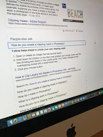

When using the "eye drop" tool and selecting
a colour within the image it then pops up with
the colour in photoshop. 
Mock up 


I did this by using InDesign a software specifically used for editorial uses and typography use. I chose to do this as I learnt that Photoshop wasn't the best to create things such as magazine covers it was more for the editing use of the images. When developing my designs to avoid the plain look of my mock ups I decided that by increasing my text size would give the cover more emphasis and a more dominant look, as well as increasing the chance of drawing in the eyes of the viewers of my exhibition.
This is a video showing all of the processes I went through 
to develop my covers and make them to the best standard I
could using inDesign.
Mock up
Final piece 

Mock up

Final piece

Roxanne Lowit

For over three decades, the unique lens of Roxanne Lowit has captured the faces, personalities, and spaces of modern culture. To review her incomparable work is to step behind the proverbial velvet rope. To see her images is to witness the creation and the celebration of fashion and art and theater and film, pleasure and joy and aesthetic delight. Lowit has photographed thousands of luminaries, including Andy Warhol, Salvador Dali, Kate Moss, Yves Saint-Laurent, Johnny Depp, Madonna, and George Clooney. Lowit has always done things differently. A native New Yorker, she was originally a textile designer. But she found her true calling crafting imagery of a different kind, and then created an entirely new genre of photography by taking her Instamatic where nobody else wanted to go: backstage at fashion shows. While everyone else was fixated on the runway, she captured the real action was where the rest of the photographers weren’t looking. Her epiphany typifies her keen eye for new possibilities—and it transformed fashion photography forever. But she has gone even further, elevating her medium into fine art. Lowit’s work has been exhibited in many of the world’s major museums, including the Metropolitan Museum of Art; the Whitney Museum of American Art; the Victoria & Albert Museum; the Warhol Museum; and the Museum of Modern Art in Moscow. Her photographs are part of the permanent collection of Japan’s prestigious Kobe Fashion Museum. She has also been featured in one-woman shows in New York, Paris, Berlin, Amsterdam, and London, as well as at group exhibitions at the Gagosian Gallery, Colette, and Art Basel Miami.
Pages in sketchbook 


For my secondary research I decided to bring my attention to a photographer known as "Roxanne Lowit" a fashion photographer that is well known for photographing the behind scenes of the fashion world and is from the time (nineties). I like her work as I feel she portrays fashion in a unusual and mysterious way as she is allowed back where no other photographer has been before and the way she documents the models is quite inspiring because she captures the models being themselves and having a good time instead of overly staging the photographs and showing the fun side of fashion. Its not all serious, she just have to look closer and go beyond the boundaries of what you aren't allowed to do. I also like how she has used specific lighting techniques to create a portrait for instance the image shown on my sketchbook of the model wearing red lipstick smoking shows the butterfly lighting beautifully. From evaluation her work I feel that Lowit uses a ring flash as the image is perfectly lit on the subject creating a dark background. From looking at her work has made me want to recap on specific lighting techniques used when taking portraits. 

Wednesday, 24 May 2017

Samples

When seeing this design printed onto a bigger
scale I felt that the text was to smart looking
to be on my cover as it is not the look I am
going for. The whole idea when I create a
magazine cover is to represent the nineties
style grunge, and I felt that this "times
Roman" text contrast with the style as the text
type itself is used for more serious publicity
such as "The Times News paper" and
many others.
Here are a variety of sample magazine covers I have created inspired by a wide selection of my research, when narrowing down my idea to only the nineties era then brought my attention to well known nineties grunge like magazines, such as Dazed, Another, ID and Wonderland. When designing my covers I have taken elements within my chosen focus of todays edgy and grunge like magazines into my work.  Further more to narrow my choices down for my final pieces I based it on which I thought were the strongest images but to find this out I decided the print them out onto a bigger scale enabling to see them up close rather than on a computer screen.  I did this by printing the outcomes as a PDF file and onto SRA3 paper, a type of paper that has a glossy finish when printed, so that before printing off properly at reprographics printing room I am able to view if any adjustments are needed.
After designing and editing this magazine cover on Photoshop I then printed it onto SRA3 paper (glossy paper) to get an idea of what my outcome would look like when printed onto photographic paper. However, when printing the finished piece I noticed a big difference from looking at the final design on the mac computer to then printing it. The design and image was more under exposed than in looked when printed, so to over come this problem I went back to my design on Photoshop and added more brightness and contrast to pull out the image further. After these adjustments I then re-printed the design and noticed a greater contrast between the two. I believe that seeing my outcomes on a bigger scale and up and close, was better than just seeing them on a screen as I was able to notice the quality difference and seen on bigger scale. 


These images I have not gone further with as I believe the lighting is perfect and the juxtaposition contrasts a lot within these designs and choice of both photo, and layout. I am overall satisfied with these specific outcomes. However, I feel that there are little arrangements that could be tweaked to make them better for instance, text blending into the background, wording arrangement not being in line with one another and a few theoretical issues all noted on my first development sheet. 
My first development sheet.

When printing this design out the exposure was totally different
when looking at the image on a mac screen, as well as when printed
to a larger format the arrangement of the wording looked slightly odd.
The word "Eve" I feel seems like It is floating rather than purposely
placed in the place where it laid. If I was too go back and edit this chosen
image again, I would crop it slightly so that there is less open space within the image.
I believe that by cropping the photograph so that the upper left is brought in, 
would allow more balance creating leading lines.

This in particular style of design was influenced by the magazine cover
"Another" of Dakota Johnson positioned laid on the floor with a white exposed background.
I recreated this by having my model positioned on the floor but instead of fully laid, 
I instructed her to have her hand of her hand creating an image portraying a grunge mood look.
I have also applied similar elements of the layout and used a colour scheme to balance
 the photograph out that juxtaposes the image. Different parts of the photo command your attention equally, 
so that perfect balance is achieved. For, instance the black title and the models top, create a perfect
balance as the white back ground contrast with the pair. If the photograph was improperly balanced  it would be  less appealing to look at and could  instantly turn off a viewer.

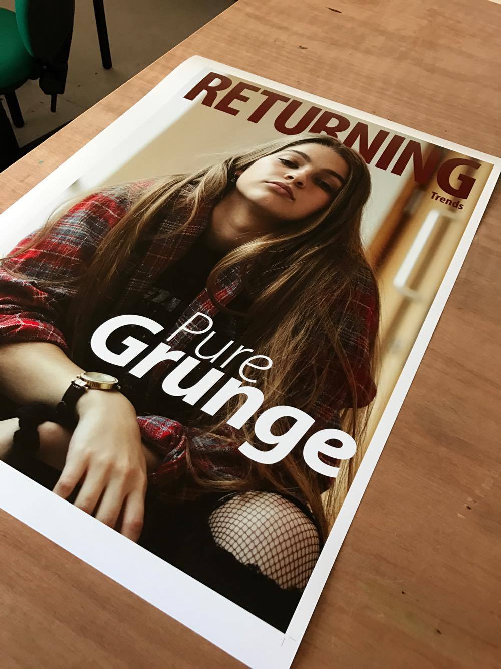
This is by far one of my favourite magazine covers
that I have designed as I believe like it says on the magazine, it is "Pure Grunge" portrayed within this image. I love how I have added the modern twist on nineties grunge and shown how it is seen as a fashion trend today. The items such as the flannel shirt and the scrunchy were influenced from my earlier research when exploring the trends that have returned in today's society. As well as in corporate the music influence of it all and adding in a modernised "Metallica" band T-shirt from Topshop creating more of a original grunge style. However, I believe that in today's day and age, band t-shirts are extremely popular but in my eyes for all the wrong reasons. Individuals of today wear them because they are seen as trendy, not for the main purpose of liking the band on the actual t-shirt today they are seen as a fashion accessory.   

Monday, 22 May 2017

Photoshoot 2

For my second photo shoot, specifically to create more outcomes that could possibly become my final pieces, I planned another photo shoot that would this time embrace the culture of grunge and how it has come about. As well as resulting in embracing trends from the nineties that have been modernised to fit in with today's society. I also intended to incorporate aspects of my research within my shoot, such as Corinne days edgy photography and the unusual ways on positioning the model, so that the attitude and body language of the model fits in with the look I am going for. As well as linking back to the overly exposed photographs of the Marc jacobs grunge collection directing the focus all on both the clothing and the model. The clothing I selected for this shoot is mainly loose clothing and band t-shirts. I chose this style so that it linked within both my research and style. Clothing such as flannel shirts, ripped jeans, denim jackets and dungarees. I also decided on my model having a natural look so I included messy hair and minimal make up, to really create the grunge theme and don't care attitude.  

From my research of magazines that show similarities within the edgy and quirky style of grunge (Dazed, Another, ID and Wonderland), I plan to used aspects such as the poses. Creating unusual and disturbing poses portraying the style and imagery portrayed through the magazines. I intend to recreate similar layouts of these specific magazines through my certain aspects for instance where things are placed within the magazine such as the bar code, wording, subtitle and title.

This time for my photo shoot I chose not to collaborate with any one to ensure myself that I am not relying on anyone but myself throughout my shoot. I planned to locate my shoot within the college grounds specifically where I was located for my last shoot,so that I am able to develop my skills further using ambient light and equipment such as light meters, reflectors and different lens. However, during my shoot we more location various times so that I was able to develop my skills with lighting e.g: camera settings.

Luckily, all of my photo shoot this time went to plan and I was able to have a successful shoot. However, I did have some difficulties with the lighting arrangement and settings within the camera but I was able to over come this and use the light meter efficiently enabling me to select the right settings. Also before starting my photo shoot bare in mind I had hired all my equipment out the day before and when collecting the essentials, they were no where to be such luckily I had traced there where a bouts to another department within college and I was able to gather what I needed to begin my photoshoot.   

Equipment list:

  • Camera-Cannon 750D/ Reason I used this camera is because its my own camera and I am comfortable with using it, aswell as having a greater knowledge and understanding about it. 
  • Lens-Macro lens/ Reason I used a macro lens was because I am forever using my regular day to day 55mm lens and felt I needed more experience with different lens, also the lens itself is great for close ups creating a good outcome of portraits. 
  • Light meter/ Reason I used a light meter was because whenever I do location shoots I usually go off my own knowledge of what I already know when it comes to adjsusting the settings when changing light. The light meter gave me a chance to use a ddifferent material when photographing and advising me on what light should be used when shooting in either light or dark surroundings. 
  • Ambient light/ I used ambient light coming directly from the open window from the right.
  • Reflector-silver and gold/ I used a reflector to give me more practice when using different materials and learning multiple ways of playing with light.


Here are all my contact sheets containing all photographs taken on the day of the photo shoot showing experimentation and development.